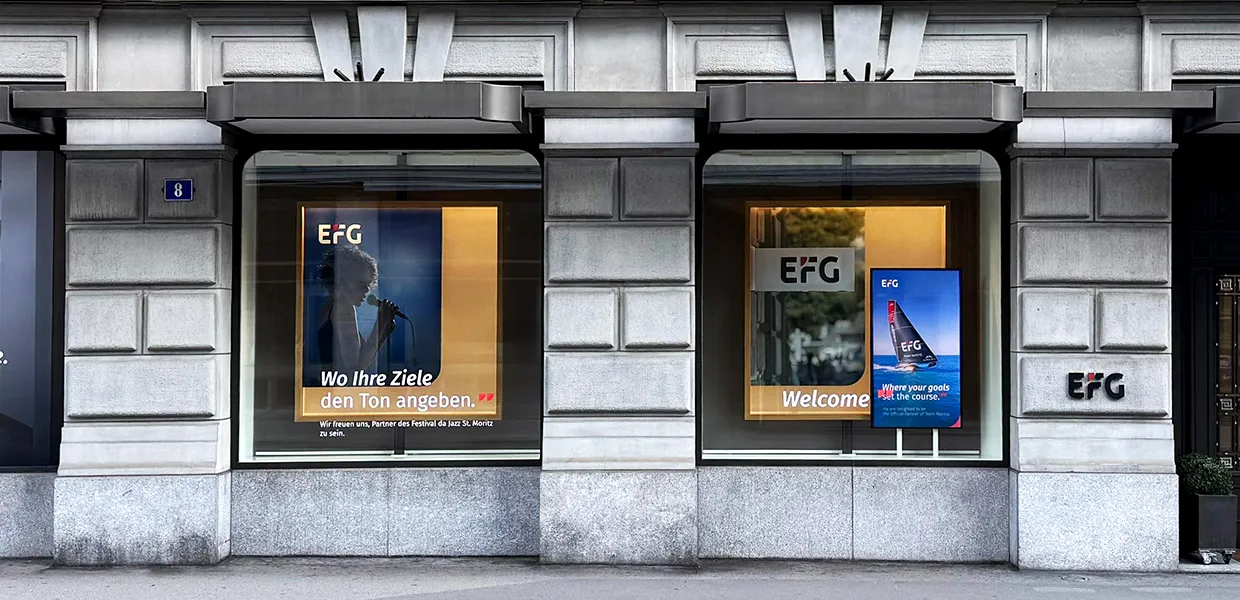
EFG International
Brand Refresh

Modernizing a global private-banking brand through renewed design and motion systems.
Art Direction
Brand Identity
Graphic Design
Motion Design
Gen AI
Context
EFG International was evolving its visual identity to reflect a more contemporary, digital-first image while preserving its heritage of trust and discretion. I modernized the brand guidelines, created templates and developed new video and motion principles to ensure global consistency across all visual communication.
Challenge
EFG International’s brand presence had become fragmented across global offices and digital platforms. Inconsistent use of color, typography, and motion diluted its visual identity and weakened its communication impact. The challenge was to modernize and harmonize the system — restoring coherence while respecting the bank’s heritage of trust and sophistication.
Solution
A complete refresh of EFG’s brand guidelines: redefining typography rules, color, composition, and motion to create a cohesive, modern system.
Refreshed Guidelines
Updated the core brand guidelines with modern grid structures, refined typography, and balanced hierarchy for both print and digital.
Motion Guidelines
Defined principles for timing, transitions, and brand animations — emphasizing calm rhythm, elegance, and precision.
Design Consistency
Created templates and examples for internal teams, ensuring cohesive output across global markets.
Iconography
A new icon system was designed to align with the refreshed visual language: minimalist, geometric, and precise.
Result
The renewed brand system strengthened EFG’s visual coherence across markets and media. Its refined rhythm, balanced typography, and consistent motion vocabulary brought confidence to the bank’s communications while reinforcing its values of trust and excellence.


Like what you saw? Let's work together.
I help brands create, modernize and clarify their visual language — from new or refreshed guidelines to motion systems that move with intent.

